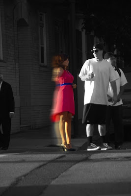


All of this politics talk has gotten me thirsty for some pointless art play. Here is a picture I took about a month ago, and since I've been playing with motion, blur, and overlay- I thought that I would try to combine them into something new. Here the original and new versions are, let me know what you think- this was a quick rough attempt, and I need to know whether it's worth going back to my original big image and re-working that version- or not. Which do you prefer?
UPDATE: One more of just a weee bit of blur on her backside...?


2 comments:
cools man. you gotta mute that white guy's t shirt a little bit though... too bright competes with the lady.
I like the original better....It stands out more.
Post a Comment